ABOUT ACTIVECAMPAIGN
ActiveCampaign brings email, SMS, WhatsApp, and CRM together in one AI-powered platform, giving small and mid-sized businesses the tools to automate growth and deliver personalized customer experiences at scale.
Agentic Onboarding
PROJECT OVERVIEW
Agentic Onboarding introduces an intelligent, guided experience between trial sign-up and the Active Intelligence homepage. Instead of directing users to a generic dashboard, this flow leverages onboarding data and real-time business insights to deliver a personalized, goal-driven starting point.
THE CHALLENGE
While users provide valuable context during trial sign-up (channels, sophistication level, migration status), that information is not currently reflected in their first time user experience. As a result, new customers must do the heavy lifting to discover value on their own, missing the opportunity to replicate the tailored “business understanding” conversation typically led by sales.
DISCOVERY
Before designing anything, I needed to understand why users were dropping off after sign-up. So I went back to basics, digging into our current platform experience and user feedback, trial drop-off data, and what competitors were actually building.
FIRST TIME USER EXPERIENCE AUDIT
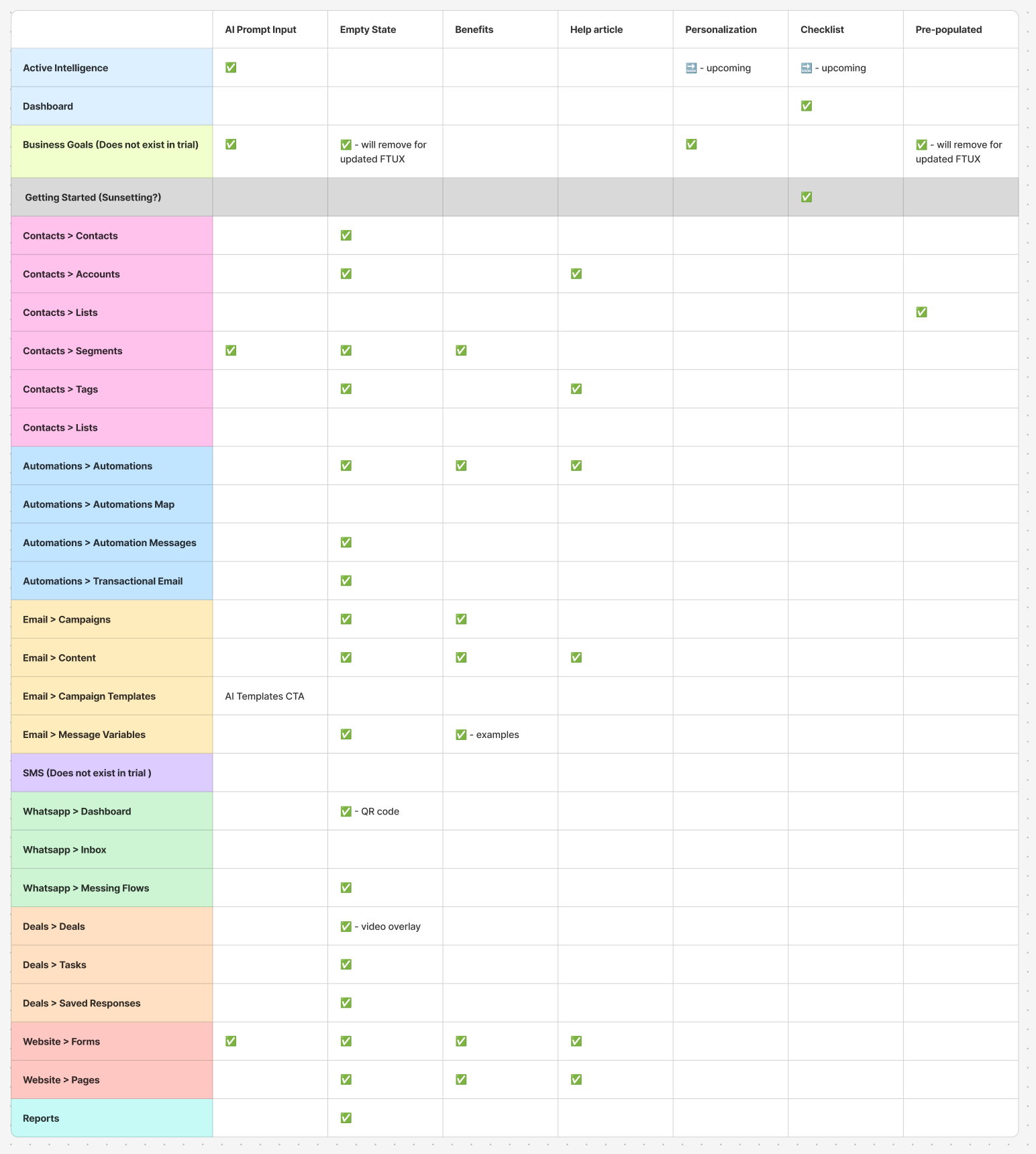
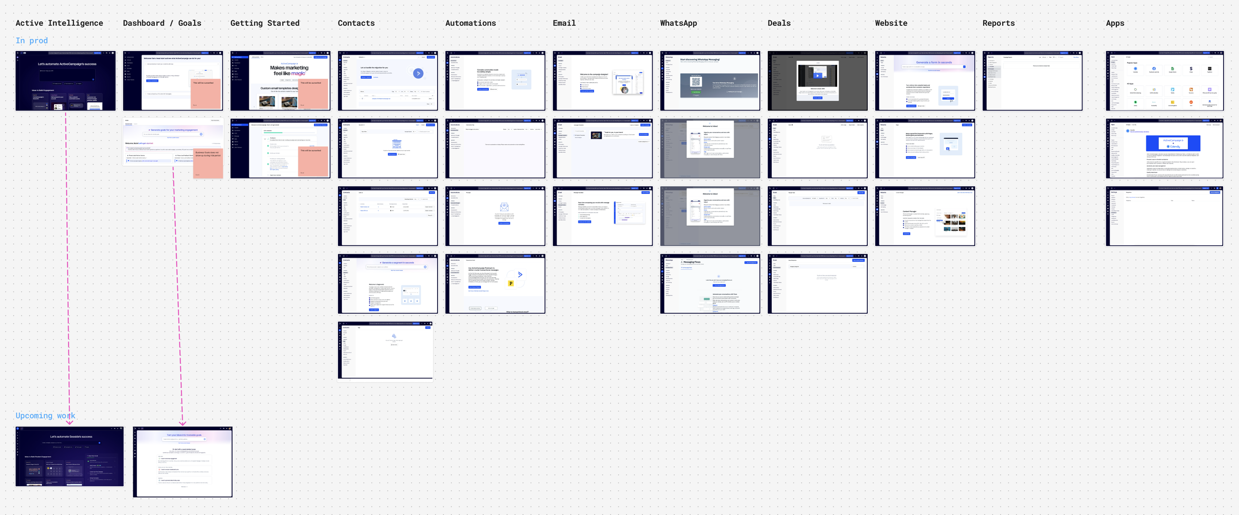
I audited over 30+ core pages (from Automations to WhatsApp integrations) against seven key onboarding pillars, including AI prompts, "aha" benefits, and pre-populated states.
The audit revealed some critical gaps:
The "Empty State" Epidemic: While most pages had a basic "Empty State" (e.g., "You have no lists"), very few offered benefits or help articles to explain why a user should create one.
Disconnected Tooling: Features like "Business Goals" and "Active Intelligence" were siloed. A user could set a goal in one tab, but the rest of the platform remained oblivious to that context, missing the chance for Personalization.
The audit made it clear: We weren't just missing features; we were missing a narrative. The platform felt like a collection of tools rather than a guided journey.
Customer Sentiment & Pain Points
Going through customer feedback, most pointed to the same problem. People weren't leaving because ActiveCampaign lacked features. They were leaving because it had too many, with no clear starting point.
Users were spending around 9 hours trying to piece together a single campaign from scratch, wrestling with strategy, copywriting, segmentation, automations, and reporting all at once. Most would poke around for a bit, get overwhelmed, and churn before ever sending anything meaningful. The gap between "I just signed up" and "I just ran a real campaign" was too wide.
I also attended one of our Study Hall sessions, a hands-on training class where real ActiveCampaign users come to build confidence and work through core marketing automation strategies in real time. Sitting in that room made the research tangible. I could see firsthand what people were actually trying to accomplish with the product, where they got stuck, and how much hand-holding was needed to get them to a point that should have felt intuitive from the start.
Competitive ANALYSIS
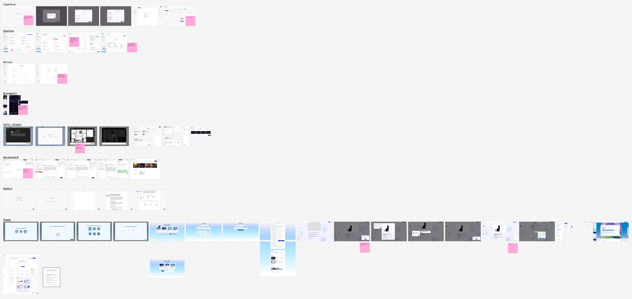
Competitive Analysis in Figjam
I looked at the onboarding approaches of AI-first platforms and a handful of emerging marketing tools. The pattern was clear: the better products were proactively analyzing context and surfacing recommendations before users even knew what to ask for. And critically, they were engineering the aha moment to land early, giving users a taste of real value within the first few minutes rather than making them earn it.
Most competitors were using AI to help users write content. That's useful, but it's not the hard part. The harder problem and the bigger opportunity was using AI to help users figure out their strategy. That's the conversation a good sales rep or marketing consultant would normally have in person. I saw a real chance for ActiveCampaign to bring that experience into the product itself.
DESIGN
Early design work with Lovable showed how motion and transitions make an autonomous AI feel responsive.
From "Scraping" to "Storytelling": The Loading Experience
Most loading screens are dead time. I wanted this one to do real work. Instead of a generic spinner, I designed a purposeful sequence that made the AI's process visible, using the wait time to immediately demonstrate value.
Using the email domain that the customer signed up with, the system scraped the website, the UI surfaced their logo and brand colors in real time, showing the import as it happened. It sounds like a small thing, but it reframed the entire moment. What could have felt like lag instead felt like the product getting to know you. By the time users reached the dashboard, the system had already proven it understood their brand, without them having to configure a thing.
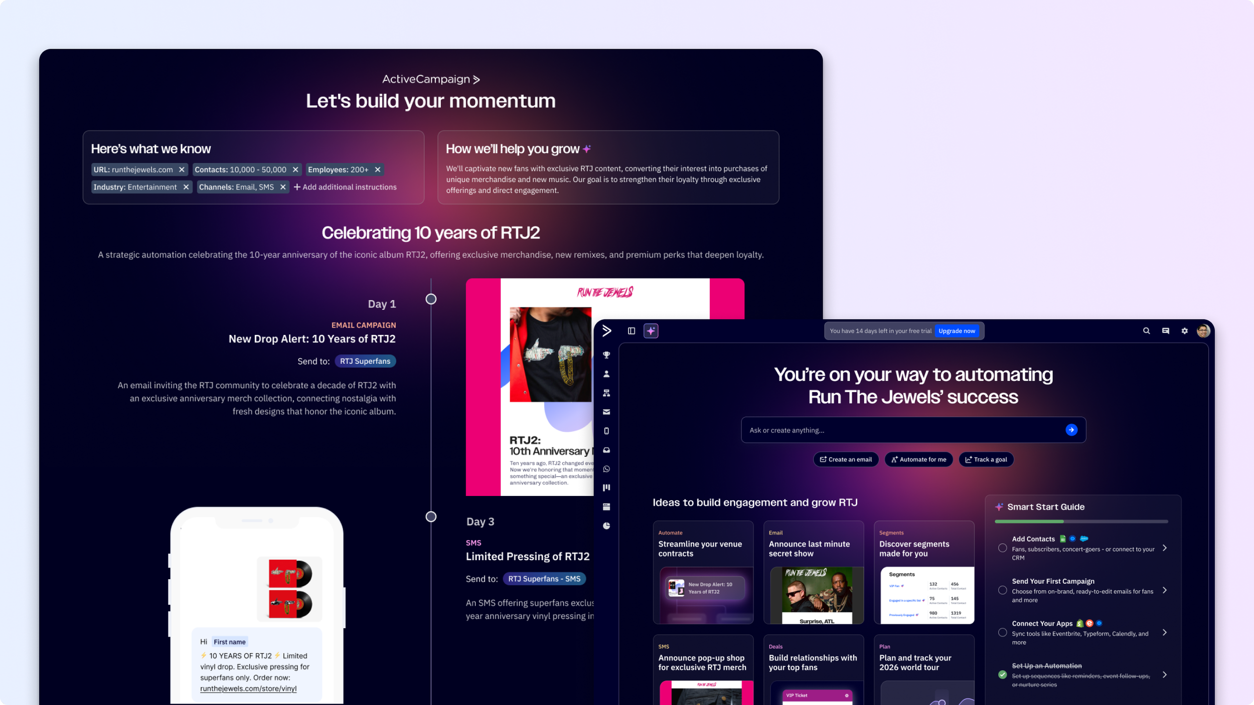
The Proactive Recommendation: The Strategy Screen
The centerpiece of the redesign was an AI-powered recommendation screen that replaced traditional form-filling with immediate strategic output. Rather than asking users what they wanted to do, the product told them what it would do for them.
Using our "Run the Jewels" test case, an ActiveCampaign customer, the screen proposed a fully formed 10-year anniversary automation strategy. This was a deliberate shift in how the AI was positioned, moving it from a content assistant to something closer to a marketing architect. To make sure that didn't feel like a black box, I designed the automation logic to be visible and modular. The wait steps, triggers, and email assets were laid out as a cohesive unit so users could review, understand, and adjust the AI's recommendations. The goal was confidence, not just convenience.
Closing the Gap: The "Active" Dashboard
The final piece was making sure the momentum from onboarding didn't stall at the dashboard door. The classic problem with powerful tools is that even after setup, users still face a "where do I start?" moment. I wanted to eliminate that entirely.
Clicking "Activate" skipped the setup phase and dropped users directly into a live dashboard, status already set to Active. Within 90 seconds, the experience shifted from orientation to monitoring. Users weren't setting up anymore, they were watching their campaign run. That transition, from "figuring it out" to "seeing results," was the whole point.
The final design
We launched this to 10% of trial users as of March 9, 2026 and are currently monitoring metrics and actively reviewing traces.